


Here is my original photo (on the left) and the edited with adjustment layers (on the right)


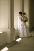
Camera info: Nikon D2X; Shutter Speed 1/160; F stop - 5.6; Date 4/15/09 (Photo taken in the photo studio on the third floor of the library. Used studio lights and the camera belongs to my employer Jeff Smith) In the photo are my sister-in-law, Jeanie and her fiance Jonny.


The first thing I did was to add a new layer and change it for smart filters (left) and then I added a mask (can be found next to the adjustment layers) and then I used the brush tool and black to make the people come through. The black paint works as an eraser, however, if you go to far you don't have to worry because you can use the white paint to bring things back that have been erased. By using these tools I brought out the subjects of the photo. This was probably the hardest part because I wanted them to look like they were in front of twirling background so I wanted to add a shadow. The way I did this was to use the black paint just a little off of their bodies at a very low opacity so the colors would appear very muted and make somewhat of a shadow. I think it worked very well.

To get the vignette on this photo I first saved my psd document with all the layers, in case I needed to change something, but then I also saved a copy that was flattened so everything would be on the same layer. Then I added a new layer and used the marquee tool to select the place I wanted to stay light, then I selected the inverse and filled it in with black. Then I reduced the opacity so the edge would be more feathered. Then I was finally done. I love how it turned out! (I added the gray border when I took the screen shot so you could see where the edges of the photo are - it is not a part of the design of this photo)


1 comment:
Awesome image. I like the swirl added to the background. Thanks for sharing.
Jamie Andersen
Post a Comment