Sunday, May 31, 2009
4 wins!
Set 4 had the most votes so I submitted that one. Click here to view photos.
Wednesday, May 27, 2009
Week 5 - Night/Light Photos
I love night photography!!!
Star Trails
Star Trails
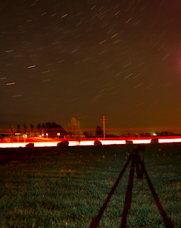
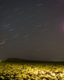
Camera Info:
Highway Night: Nikon D50; Shutter Speed: 10 mins; F stop: 4.0; No Flash; Date:5/22/09; Beaver Dick Park - Madison County - ID
Country Night: Nikon D50; Shutter Speed: 12 mins; F stop: 4.0; No Flash; Date: 5/25/09; Dry Farms - Madison County - ID
Fire & Lights
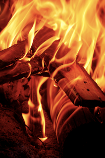
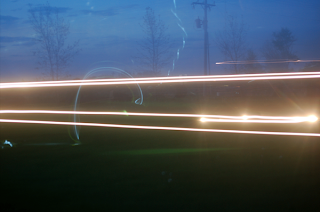
Camera Info:
Fire: Nikon D50; Shutter Speed: 1/125; F stop: 4.8; No Flash; Date:5/22/09; Beaver Dick Park - Madison County - ID
Lights: Nikon D50; Shutter Speed: 15 sec; F stop: 4.0; No Flash; Date:5/22/09; Beaver Dick Park - Madison County - ID (White lights - car head lights; Blue lights - glow-in-the-dark frisbee; camera on tripod - turned camera to get more light action)
Other Night Shots
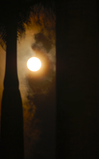
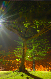
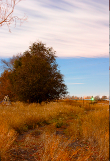
Camera Info:
Moon: Nikon D50; Shutter Speed: 1/3; F stop: 5.6; No Flash; Date:5/30/07; Temple grounds - Laie - Oahu - Hawaii
Night Tree: Nikon D50; Shutter Speed: 25 sec; F stop: 14.0; No Flash; Date: 6/14/07; BYU-Hawaii Campus - Laie - Oahu - Hawaii (light source - street lamps)
Night Scene: Nikon D50; Shutter Speed: 2.5 mins; F stop: 6.3; No Flash; Date 11/4/06; Hibbard-Rexburg ID
Like I said - I love night photography - to see more of my night photography - click on the link below
MORE NIGHT PHOTOS
Week 5 - Edge Effects
Camera Info
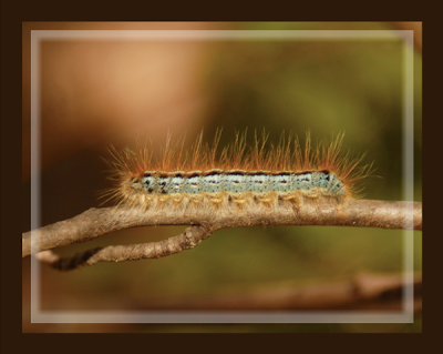
Caterpillar: Nikon D50; Shutter Speed 1/60; F stop: 5.6; Flash On; Date: 6/13/08; Big Springs Camp - Provo Canyon - UT
Double Border
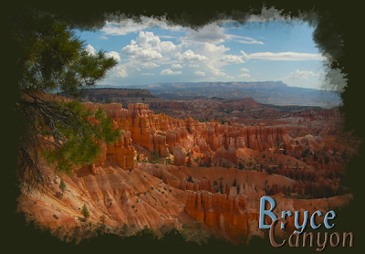
- Add rectangle shape (white - make sure Shape Layer is selected in top left corner) inside the image - leaving a little so you can still see the image
- Add a mask to the image
- Add rectangle shape (black - make sure Fill Pixels is selected in top left corner) on mask just a bit inside the white rectangle - leaves a "hole" in the center of the white rectangle showing the image underneath
- Reduce Opacity of rectangle layer (50% or so)
- Add filter - motion blur - Angle: 0 - Distance 45 px
- Add filter - motion blur - Angle: 90 - Distance 45 px
Bryce Canyon: Nikon D50; Shutter Speed: 1/800; F stop: 8.0; No Flash; Date: 5/19/06; Bryce Canyon - UT
Brush On Effect
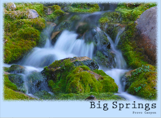
- Open edited image
- Add new layer (Shift - Command - n)
- Set default colors (black = foreground - white = background)
- Fill layer with white (Command-delete)
- Add a black layer (Alt - click on mask)
- Use brush tool - thick heavy brushes at different opacities
- Changed the white layer to dark green pulled from the photo
Big Springs Waterfall: Nikon D50; Shutter Speed: 1 sec; F stop 27; No Flash; Date 6/13/08; Big Springs Camp - Provo Canyon - UT
Sprayed Edge Effect
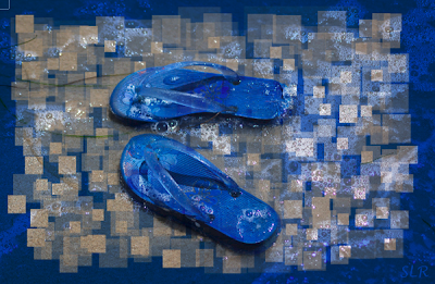
- Rectangle Marquee inside the photo leaving at least half an inch around each edge
- Apply Quick Mask (Command q)
- Choose filter - Brush strokes - Spatter (can use sprayed strokes) Increase radius and length to get best effect
- Get rid of Quick Mask (q)
- Select Inverse (Command - Shift - i)
- Choose background color from the image
- Fill selection with background color (delete)
- To add more border: Image - Canvas Size - add as much as you want - make sure to apply the correct color
Flip Flops: Nikon D50; Shutter Speed: 1/3200; F stop: 4.5; No Flash; Date: 7/7/06; Beach near San Diego CA
Brush On Effect
- Open edited image
- Add new layer (Shift - Command - n)
- Set default colors (black = foreground - white = background)
- Fill layer with white (Command-delete)
- Add a black layer (Alt - click on mask)
- Use brush tool - square brushes at different sizes and opacities
- Changed the white layer to dark blue from photo - combined the layers using the multiply option
Tuesday, May 26, 2009
Two Choices
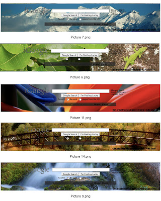
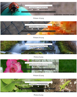
I really need some help - I like both number 4 and number 8 of the contact sheets! I need to know what people's votes are!!! We are going for sets here - not specific photos. I only picked photos I really liked and felt comfortable sharing with the world - so the issue is not which photos are best but rather what set fits together the best.
#4
#8
#4

#8

Friday, May 22, 2009
igoogle contest
OK - this has nothing to do with custom images - but I thought if I posted on this blog perhaps I would be able to get some feedback from classmates. Here's the thing - igoogle is having a contest to create themes - using photographs. So I went through my photos and found my favorites that could be cropped to the right size. Each theme has to have 5 photos that fit together somehow (this doesn't necessarily have to be a theme you can name - but just so long as they all look like they fit together.)
I have uploaded 7 of my favorite sets of 5. If you like one of these sets a lot please let me know. If you part of the set but not all the photos let me know that. If you see another one from a different set that you think would fit well let me know! I just want to know your opinions! There is no right or wrong answer!
Each set has a number at the top (example - ContactSheet001) If you like one of the sets that how you can let me know which number you like best. Each photo also has a caption (underneath) that says what number it is (example - picture1.png) if you want to let me know which photos you like best that would be helpful!
Thanks for your help!
Tuesday, May 19, 2009
Week 4 - Bannack Best
The Old Trunk - Dr's house
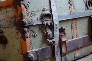
1/10; F4.5
Audrey with flowers
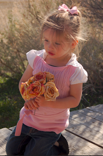
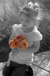
1/180; F5.3 (left one edited with b&w layer masked out so flowers show through)
Part of a wheel - I think
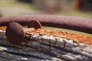
1/350; F5.0
Hotel Mead & flowers by the red door
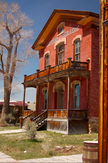
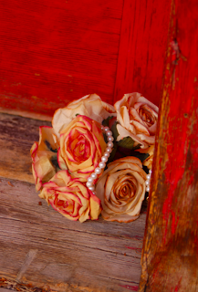
1/500; F 5.8 (polarized filter used) - - 1/10; F 5.6
Front Door Handles - Hotel Mead
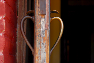
1/180; F 4.8
Old Stove & Ghost on the Stairs - Hotel Mead
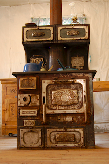
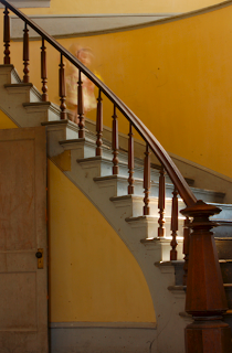
1/6; F 4.0 - - 2 sec. F 22
Hotel Stove with a cool shadow
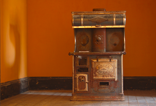
1/6; F 4.8
A ghost named Bake (a combination of Ben and Jake Ü)
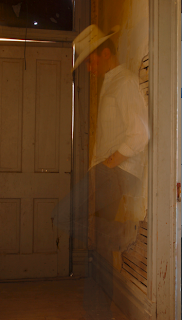
8 sec; F 9.5
My Ghostly Hand
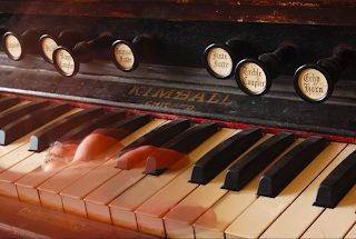
3 sec; F 11
All photos taken with a Nikon D50 camera, ISO 200
Just for fun
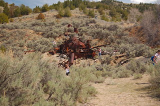
How many classmates can you find? - at the old mill
Bannack Panoramic - 7 photos
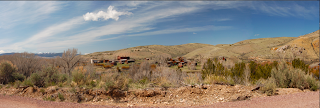
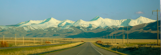
On the way home - Panoramic - 1 photo

1/10; F4.5
Audrey with flowers


1/180; F5.3 (left one edited with b&w layer masked out so flowers show through)
Part of a wheel - I think

1/350; F5.0
Hotel Mead & flowers by the red door


1/500; F 5.8 (polarized filter used) - - 1/10; F 5.6
Front Door Handles - Hotel Mead

1/180; F 4.8
Old Stove & Ghost on the Stairs - Hotel Mead


1/6; F 4.0 - - 2 sec. F 22
Hotel Stove with a cool shadow

1/6; F 4.8
A ghost named Bake (a combination of Ben and Jake Ü)

8 sec; F 9.5
My Ghostly Hand

3 sec; F 11
All photos taken with a Nikon D50 camera, ISO 200
Just for fun
How many classmates can you find? - at the old mill

Bannack Panoramic - 7 photos

On the way home - Panoramic - 1 photo

Monday, May 18, 2009
Week 4 - Grunge & Text
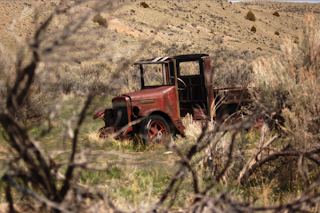
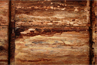
Camera Info:
Truck - Nikon D50; Shutter Speed: 1/1500; F stop:5.3; no flash; 5/15/09 - Bannack Ghost Town, Montana
Texture - Nikon D50; Shutter Speed: 1/15 ; F stop:4.8; no flash; 5/15/09 - Bannack Ghost Town, Montana (inside the old mill) - tripod used
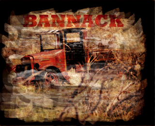
Grunge:
Photo: Old Truck
Added solid color fill layer (tan/rust color)
Photo: texture layer
Open channels
Option-click on green (selects the pixels without selecting the whole picture)
Pasted the selected texture to the old truck
Added an adjustment layer (levels)
Worked with levels until I liked the result
Edge:
Used Marque tool to select the whole photo
Selected the inverse (command-shift-i)
Applied Quick Mask (q)
Found Thick and Heavy brushes from drop down menu (b; brush tool)
Used different opacity on the 1st brush until I liked the result
Removed Quick Mask (q)
Selected the inverse (command-shift-i)
Added solid color fill layer - used a dark brown from inside the truck
Text:
Opened copy of the photo after the grunge was placed on it but before the edge was put on
Used the Type Mask - Horizontal
Font used - Rockwell Extra Bold - size 12pt
Clicked on the black arrow
Copied selection of BANNACK letters to a new document with transparent background
Copied BANNACK layer to the truck edited photo
Stretched BANNACK letters to be as big as I wanted them
Added mask to texture layer
Used black paint to mask out part of the texture layer so the color of the text could come through
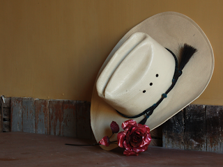

Camera Info:
Hat - Nikon D50; Shutter Speed: 4 seconds ; F stop: 19; no flash; 5/15/09 - Bannack Ghost Town, Montana (inside the hotel kitchen) - tripod used
Texture - Nikon D50; Shutter Speed: 1/15 ; F stop:4.8; no flash; 5/15/09 - Bannack Ghost Town, Montana (inside the old mill) - tripod used
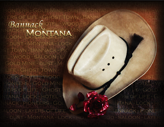
Grunge:
Photo: Hat & Rose
Added solid color fill layer (dark red - low opacity)
Photo: texture layer
Open channels
Option-click on green (selects the pixels without selecting the whole picture)
Pasted the selected texture to hat & rose (turned sideways & stretched so there wouldn't be lines straight across)
Masked out part of the texture on the hat and rose
Added Layer Adjustment mask
Text
Added text box over whole image
Typed words to do with Bannack
Repeated the words so there would be a lot
Copied the layer of text
Changed one layer of text to a pink from the rose - left the other a yellow from the hat
Moved the text layers around so both sets of text show and vary
Added new Bannack layer of text
Added new Montana layer of text
Kept Montana the same font as the background (Copperplate Gothic Light)
Changed Bannack font (Monotype Corsiva)
Added Bevel/Emboss effect to both layers of text
Added drop shadows to both layers of text
Added a rectangle object behind these two layers of text
Masked out the edges of the box
*I did this part to help the text stand out from the background a bit more
Vignette
Added new layer
Used the Marque tool with a 50% feather to select a rectangle shape
Selected the inverse (command-shift-i)
Filled layer with foreground color (option-delete)
Reduced the opacity some on this layer
Burned the edges on the background just a tiny bit to help the corners stay really black
Saturday, May 16, 2009
Preview of Bannack Shots
Here are my favorites of the photos so far. For class we have to do all sorts of effects and other things to them so these won't necessarily the photos I turn in for class - but as of now these are my favorites.
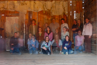
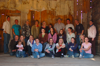
Class Photos - ghost shot - Left -- Everyone inside the Saloon - right

Panoramic Shot of Bannack taken up by the old mill - This was actually 7 shots I combined BY HAND (it can be done in Photoshop but I only have Photoshop Elements at home)
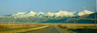
The view on the way back - this photo was taken through the windshield of the van.
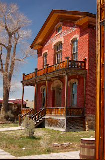
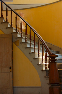
The Old Hotel -left- Ghost Girl on the stairs in hotel- right (Audrey)
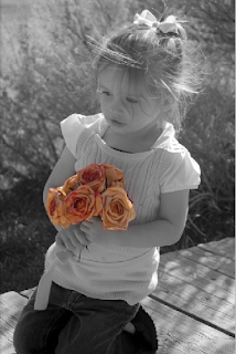
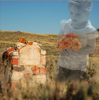
Audrey holding flowers (left)- this shot was totally unposed. I love how this photo turned out! We stopped at the graveyard on the way home for about 3 minutes. I combined my favorite of the gravestones with the photo of Audrey. (right)
Click on the photos to view them larger


Class Photos - ghost shot - Left -- Everyone inside the Saloon - right

Panoramic Shot of Bannack taken up by the old mill - This was actually 7 shots I combined BY HAND (it can be done in Photoshop but I only have Photoshop Elements at home)

The view on the way back - this photo was taken through the windshield of the van.


The Old Hotel -left- Ghost Girl on the stairs in hotel- right (Audrey)


Audrey holding flowers (left)- this shot was totally unposed. I love how this photo turned out! We stopped at the graveyard on the way home for about 3 minutes. I combined my favorite of the gravestones with the photo of Audrey. (right)
Subscribe to:
Comments (Atom)


