Tuesday, June 30, 2009
Week 10 - Holiday Choice - more new portraits
I decided to make a collage of all their photos with the saying they're planning on putting on the wall with the new portraits. I like how it turned out. I am learning all sorts of good stuff about editing photos and adding enhancements in Photoshop - I'm so glad I got a chance to take the Custom Images class!
Baseball Portraits
Ben and Jeff's baseball team played Mason and Keaton's baseball team for the championship this week. Ben and Jeff's team won - Mason and Keaton both got injured...not sure that is fair - but I'm happy with the way the photos turned out!
Camera Info soon to come
Monday, June 29, 2009
Week 10 - Holiday Choice
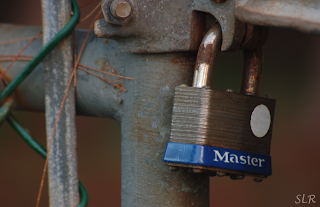
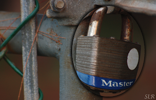
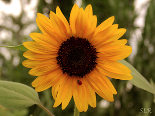
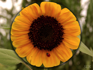
This week we get to chose something out of the book to try. I tried the fish eye lens effect for these.
Steps
Choose the elliptical marquee tool - no feathering - create a circle or oval shape around what you want to fish eye - you will probably want to include a little more than you think.
Select the inverse (Command - Shift - i)
Delete (this gets rid of the everything but what is in your marquee)
Select the inverse again (Command - Shift - i)
Go to Filter - Distort - Spherize
Start at 100% and see how you like that. If it isn't enough - like on the above photos - try adding another of the same filter at 50% for a total of %150 - or maybe even 200%
Before you deselect your marquee copy and paste it into a new (transparent?) document if you don't want a white background. I put these edits back in their original images because I thought it looked pretty cool.
When you put these fisheye effects into a new document or on an existing document you will want to add a drop shadow and perhaps a stroke so that it is very plain to see that you did the edit and you meant for part of the photo to look bulgy. Both of the above photos have drop shadows as well as strokes.
Wednesday, June 24, 2009
Week 9 - Water Photos
Camera Info:
Waterfall 1: Nikon D50; Shutter Speed: 1 sec; F stop: 27.0; No Flash; Date: 6/13/08; Big Springs Camp - Provo Canyon
Rain on the Roof: Nikon D50; Shutter Speed: 1/80; F stop: 5.6; No Flash; Date: 10/4/2006; Girls Dorms Rexburg ID
Camera Info:
Floating Flower - Nikon D50; Shutter Speed: 1/500; F stop: 5.6; No Flash; Date: 5/5/07; USS Arizona Memorial - Pearl City - Oahu - Hawaii (The oil from the ship mixes with the water to give it the shiny look)
Waterfall 2: Nikon D50; Shutter Speed: 1 sec; F stop: 27.0; No Flash; Date: 6/13/2008; Big Springs Camp - Provo Canyon
Poster Idea
This is the print I'm thinking of printing for my poster print. I'm wondering if I should add some text up in the upper left hand corner. What do you think?
Wednesday, June 17, 2009
Photo Book Spreads
Do you like this template better? These are two page spreads (I haven't fixed the text on the HDR page yet) Should I move the text to the bottom of the page and align it to the right rather than the left?
Tuesday, June 16, 2009
Week 8 - Panoramic Photos
Here are the three photos I put together
and here is the final product. I used the photo merge tool in PS to put these together. Then I changed some levels and did a match color on another photograph where I really liked the colors in the sky. I also took out the telephone wire going through the middle of the photo as well as a few of the really bright and distracting lights.
Thursday, June 11, 2009
Week 7 - Photo Journal - Edit - Book Spread
Right now this is just a one page spread. I'm trying to figure out what I want to do with stripe - I don't want it to totally cut the page in two pieces but I do need something besides just the photos and text. Any ideas????
This photo shows the two page spread - in case you were wondering. The line down the middle won't show up in the final book.
Week 7 - Photo Journal
Photos from each day this week
Friday June 5 - Thursday Jun 11
Camera Info: Nikon D50; Shutter Speed: 1/90; F stop: 4.5; No Flash; Date 6/5/09; BYU I gardens
Camera Info: Nikon D50; Shutter Speed: 1/60; F stop: 5.6; Flash; Date 6/6/09; Corbin Eating Cake
Camera Info: Nikon D50; Shutter Speed: .7 sec; F stop: 5.6; No Flash; Date 6/10/09; Sunflower
Camera Info: Nikon D50; Shutter Speed: 1/6; F stop: 4; No Flash; Date 6/7/09; Rolls
Camera Info: Nikon D50; Shutter Speed: 1.5 sec; F stop: 5.3; No Flash; Date 6/8/09; Forks
Camera Info: Nikon D50; Shutter Speed: 1/45; F stop: 5.6; No Flash; Date 6/9/09; Light/brick wall
Camera Info: Nikon D50; Shutter Speed: 1/750; F stop: 5.6; No Flash; Date 6/11/09; Temple View from my apartment - yes it's ok for you to be jealous of this view - it is pretty amazing!
Thursday, June 04, 2009
Week 6 - Portraits
Photo Information:
Ball Player: Nikon D2X; Shutter Speed: 1/125; F stop: 9; Studio Lighting; Date: 4/16/09; Rexburg ID- studio on 3rd floor of library (Studio Equipment and camera belong to Jeff Smith - but I set it up)
Cody: Nikon D50; Shutter Speed: 1/125; F stop: 4.2; Date: 8/25/07; Salem Pond - Salem UT
Boys in the field: Nikon D50; Shutter Speed: 1/250; F stop; 4.8; No Flash; Date: 5/26/08; Payson Canyon, UT
Terese and me: Nikon D50; Shutter Speed: 1/400; F stop: 4.5; Date: 6/23/2007; Pearl City, Oahu Hawaii - one of my favorite portraits I have EVER taken.
Photo information will be coming on these and the photos below shortly. Click on photos to enlarge. To view more portraits click HERE
Monday, June 01, 2009
Week 6 - Portrait Edits
Photo Information:
Studio: Nikon D700; Shutter Speed 1/160; F stop: 11; Studio Lighting; Date: 5/29/09; taken for Mother's Weekend in the BYU - I bookstore (Equipment of Jeff Smith) - Edits - I smoothed out the faces a bit and took out the extra glare out of their eyes - so they just have one light rather than two in their eyes. I also added a burn layer and masked out the people so the background would be darker and the people would stand out more.
Corbin: Nikon D50l Shutter Speed: 1/500 ; F stop: 5.3 ; No Flash; Date: 7/9/08 ; San Clemente Beach California - Edits - I changed the levels - cropped the photo in a bit - used the clone stamp to take out any remaining objects so it would just be sand behind him. I put the photo on a plain white background and used a mask and rectangle objects to take out the stripes. I also used a rectangle shape to make the white border around him. Then I used a black shape to bring him back into the photo. Then I added a mask of levels and added a mask to that to take off the extra color from him - but I wanted the darker color on the rest of the image. Then I added text (two separate layers) and then I made sure they both had the same effects on them.
Subscribe to:
Posts (Atom)